With over 13 years of experience in email signature design and management, we understand that an email signature is more than just a sign-off at the end of your emails, it’s a vital component of professional communication. A well-crafted HTML signature not only conveys essential information but also reinforces your brand identity and enhances credibility in every interaction.
Studies show that consistent branding across all touchpoints can increase revenue by up to 23% (Forbes). Your email signature is no exception; it plays a critical role in presenting a cohesive and professional image while providing recipients with key details about you and your company.
Additionally, a study by the Radicati Group found that over 300 billion emails are sent daily, making email one of the most used communication tools in business. Ensuring that your email signature is polished and well-structured helps you stand out in crowded inboxes and leave a lasting impression.
Let's dive into the essential components of an effective email signature, explore why each element matters, and see why top brands like Universal Music, Keller Williams, and Seattle University trust Email Signature Rescue to craft professional, polished signatures.
Gone are the days of clunky, oversized email signatures that resembled a chaotic patchwork of graphics, fonts, and endless links. In the early days of email communication, signatures were often bulky and cumbersome, filled with flashy images and intricate designs that distracted from the actual message. These signatures might have seemed innovative at the time, but they often led to slow loading times and a jarring experience for the recipient.
As technology evolved and email clients became more sophisticated, the need for a streamlined and professional appearance became increasingly clear.Today, we’re witnessing a shift toward minimalist designs that prioritize clarity and efficiency. Modern email signatures are sleek and well-organized, allowing for easy readability and a focus on the key information.
"The current trend emphasizes clean lines, professional fonts, and strategically placed links that encourage engagement without being obtrusive."
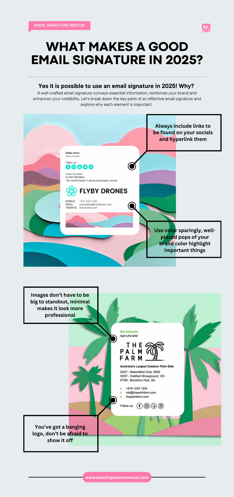
Rather than overwhelming recipients with a barrage of colors and graphics, the current trend emphasizes clean lines, professional fonts, and strategically placed links that encourage engagement without being obtrusive. This evolution reflects a broader change in how we approach digital communication, where simplicity and professionalism reign supreme.
Additionally, responsive design has become a vital aspect of crafting email signatures. With the rise of mobile device usage, it’s crucial that signatures look great on any screen size, from smartphones to desktops. Gone are the days when signatures could break or become misaligned, frustrating recipients. Today’s email signatures not only represent individual professionals and their brands but also convey a sense of care and attention to detail. In essence, the resurgence of well-crafted email signatures marks a return to professionalism, reminding us that sometimes, less truly is more.
Why Email Signatures Matter
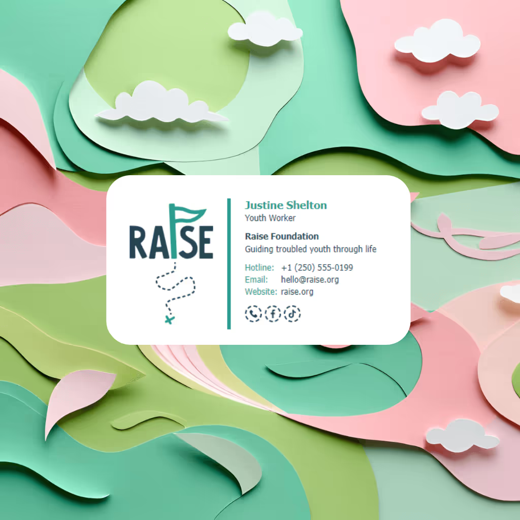
Email signatures serve as digital business cards, making a lasting impression on every recipient. They provide essential contact information, reinforce brand identity, and can even drive marketing initiatives.

Made with Email Signature Rescue
Essential Elements of a Professional Business Signature
1. What's in a name
Importance: Your name is the most critical part of your email signature. It’s how recipients will identify you, making it vital for recognition and establishing a personal connection.
Best Practices:
- Use your first and last name for clarity. Your middle name isn't needed, but it is optional. If you work in a large company and several people exist with the same name, we would recommend using a middle initial or a full middle name to help you be recognized easily. For example, Michelle G. Davis.
- Consider including your preferred name if you commonly go by a nickname. Don't use a nickname if it's personal or offensive.
- If your name is unique or difficult to pronouce, consider writing out the phonetic version in brackets next to your name - for example Siobhan O’Rourke (shih-VAWN). Some people are just really bad at pronouncing names, this can give them a friendly reminder.
- If you've recently changed your name, you can put the words "nee" next to your new name in your email signature, along with your previous maiden surname to remind people that you've changed it. For example, Siobhan O’Rourke (nee Harris).
2. Job Title
Importance: A well-placed job title in an HTML signature provides context about your role within the organization. It helps recipients understand your position and authority, fostering trust and credibility.
Best Practices:
- Keep it straightforward and relevant.
- Avoid jargon unless it’s commonly understood within your industry and your customers.

3. Company Name and Logo
Importance: Including your company name and logo reinforces your brand identity and adds a professional touch. It makes your email signature easily recognizable and promotes brand consistency.
Best Practices:
- Ensure the logo is of high quality and properly sized.
- Link the logo to your company’s website for easy access.
4. Contact Information
Importance: Providing various methods for recipients to contact you in your email signature is crucial. It ensures that they can easily reach out for follow-up questions or networking opportunities.
Best Practices:
- Include a direct phone number or mobile number and email address.
- Include social media icons with clickable links through to all your social media pages.
- Format the information clearly to enhance readability.
- Offer a downloadable vcard so the recipients can downlad your contact information easily
Did you know Email Signature Rescue adds a link for recipients to download vcards automatically in our software? Just add a vcard social icon and our software does the rest!
5. Website and Social Media Links
Importance: Links to your website and professional social media profiles allow recipients to learn more about you and your work. This can enhance your credibility and provide more context about your professional presence.
Best Practices:
- Choose platforms that are relevant to your industry (e.g., LinkedIn, Twitter).
- Ensure all links are active and direct to professional accounts.
6. Call to Action
Importance: A call to action (CTA) encourages recipients to engage further with your work. Whether you want them to visit your website, read your latest blog post, or schedule a meeting, a clear CTA can guide them.
Best Practices:
- Keep it concise and relevant.
- Use a hyperlink for easy access.
Made with Email Signature Rescue
7. Disclaimer (if necessary)
Importance: Depending on your industry, including a disclaimer can be important for legal reasons, particularly in finance, law, and healthcare sectors. It protects both you and your organization by clarifying confidentiality and other legal considerations.
Best Practices:
- Keep it brief and straightforward.
- Ensure it’s visible but not intrusive.
Did you know you can link directly to an online disclaimer with Email Signature Rescue? We include a Read More link in our Disclaimer options so you can be brief in your email signature, but elaborate more if needed.
8. Visual Elements
Importance: The overall design of your email signature can affect how it’s perceived. A clean, well-organized email signature can enhance professionalism, while a cluttered, messy one with different font sizes and too many colors may detract from your message.
Best Practices:
- Use consistent fonts and colors that align with your brand.
- Keep the design simple and avoid excessive images or colors.
An effective email signature is more than a formality, it’s a powerful branding tool that enhances professionalism and communication. By incorporating these essential components you can create an professional email signature that reflects your identity and promotes your brand.


