12 Common Mistakes You're Making With Your Email Signature

Do you use an email signature in every email you send? You could be making some pretty big mistakes in your email signature.
We've addressed below how you can correct these mistakes and make your email signature pop out and grab the attention of the person on the other end.
Here's our list of 12 common mistakes you could be making with your email signature.
1Not hosting images on a web server
If you're not hosting all of your images in your email signature on a web server, you're doing it wrong. Images that aren't hosted can appear as attachments in some email clients, or sometimes even not appear at all. Get your images hosted on a web server and link to the full URL path in the HTML code.
2Using fonts that are not web safe with no fallback
If you use a font in your email signature that most people don't have installed on their computers or phones, like a Google font for example, and you don't have a fallback font specified, then most people won't see it and it's likely that your email signature will look pretty messed up too. Find out which fonts are safe to send in email signatures here.
3Using lots of different fonts
Using lots of different fonts in your email signature is a big no-no. Why? In our professional design opinion, keeping the font consistent throughout the signature makes it look more modern, classy, clean and tidy. And unless you own a kindergarten, leave out Comic Sans.
4Text links to all your different social pages
Social icons can help here. They do a great job of eliminating the cluttered look that text links to all your different social pages like Facebook, Twitter and LinkedIn can create. There's so many social pages these days and while showcasing all of your social media pages can boost your customer's confidence in you and your business, presenting too much information in way that is not easy for the customer to read, does not. Read more about how to add social icons to your signature here.
5Adding too many text colors
So you like green, and blue, and pink, and orange, and purple, and yellow... that's great. Just pick one of those colors as a feature text color and mix it with a nice subtle dark grey or black text color to give your text a little visual impact. Don't use lots of different text colors if you want your signature to look professional, stylish and well-designed.
6Not testing your email signature in different email clients
Once your signature leaves your own email client, it could go to a number of different email clients on desktop computers, laptops, tablets and phones. If you don't test to make sure the HTML is cross-compatible with all major email clients (like we do at Email Signature Rescue), your customers may be getting a very different version to what you think you are sending. Test, test and then test some more.
7More than two primary images
Keep the primary images you use in your email signature to a maximum of two, this may include something like a business logo and a personal profile image. Keep the images small and neat, we'd suggest a maximum height and width of about 250px. Use more than two primary images in your signature and your customers may start charging you for the data it costs them to download all those images every single time you send them an email.
8Promotional attachments
Don't attach PDFs, Word Documents or any other kind of attachment along with every email you send. Instead include a link to the attachment for your customers to download it from your website if they choose to. Forcing customers to download attachments every time you email them can instill anger in even the most calmest of people.
9Too many banner or promotional images and banner images that don't link to anything
Only promote up to a maximum of four things at a time using banner images at the base of your email signature and ensure that each banner links through to the correct file or page on your website. Also, ensure that the banner images have been designed professionally and don't detract from the design of the signature and test them for conversions using Google Analytics click tracking. Don't be afraid to test different images to see which ones convert more clicks.
10Using just an image as your signature
Not only is this a flag for most spam filters as the text:image ratio is too low, it probably does more harm than good, when a customer goes to click your Facebook page link and they are taken to your website because your signature is just an image with only one clickable area. Get your signature professionally coded so that all items are clickable separately and take your customers to the correct information they are after.
11Personal quotes in professional signatures
Don't share personal quotes in professional signatures. Some customers can be easily offended or may not like the humor you're using. Unless you're a writer, leave the quotes out.
12Long legal disclaimers
Only put in what is really necessary. If you don't send private information over email, consider if you need one at all. If you do send private information over email and need a long disclaimer, include a few critical lines and then link to an online version.
So what does a professional email signature look like?
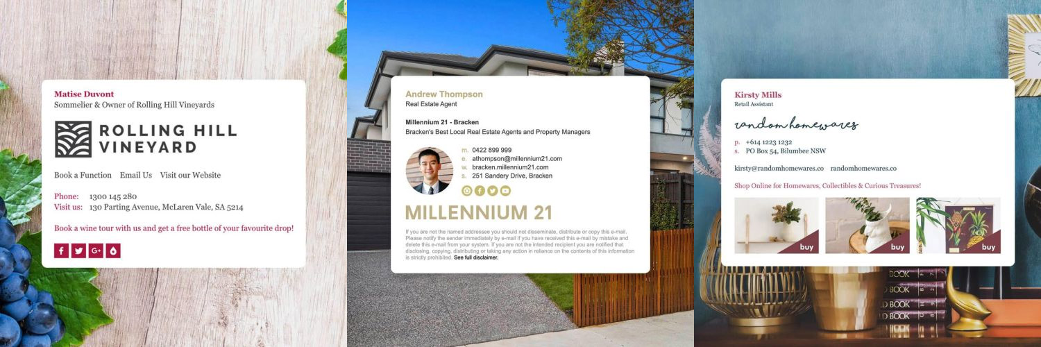
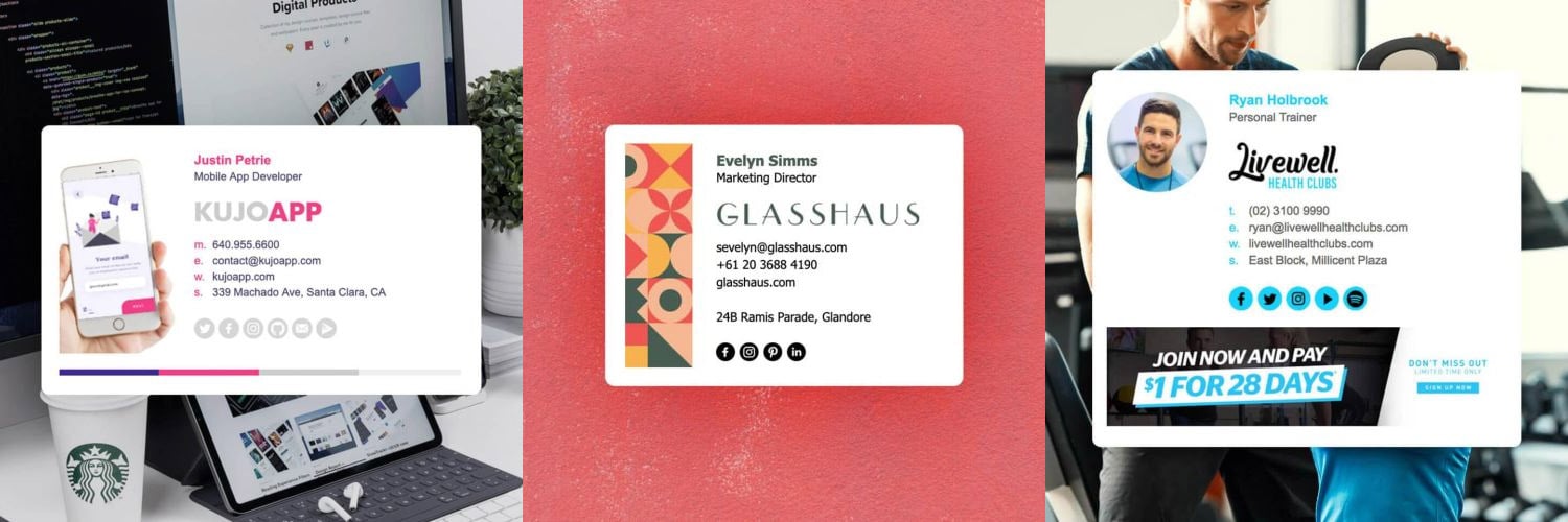
Here's some examples of good email signature design. All of these examples were made with our Email Signature Rescue software and our email signature templates.
